Vanderbilt University
We shook things up during my Vandy Era. We transformed content. We elevated digital experiences. We redesigned Vanderbilt Magazine, the university’s flagship publication for the past century. We won awards. We challenged creative. We humanized storytelling across the university. We collaborated with agency partners and drove ideation and execution for central Communications & Marketing’s very first brand campaign. We produced a podcast hosted by Provost and Vice Chancellor for Academic Affairs, C. Cybele Raver and tapped Podcast Hall of Fame inductees, Matriarch Digital Media, to help us scale it. Vandy was my first foray into academia, and under my leadership, we did some pretty herculean things. I’m proud of the impact we made.
Quantum Potential
Research at the speed of curiosity. Through documentary shorts, podcast interviews and faculty profiles, Quantum Potential brings you stories of curiosity and discovery. See how Vanderbilt’s greatest minds tackle humanity’s greatest challenges.


Listen
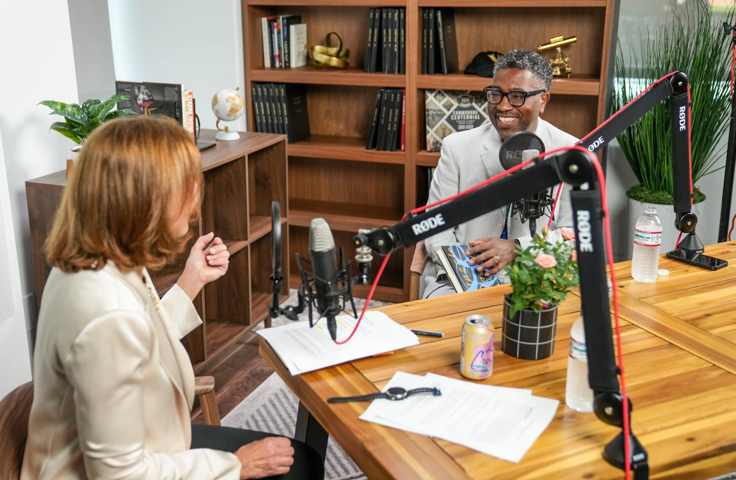
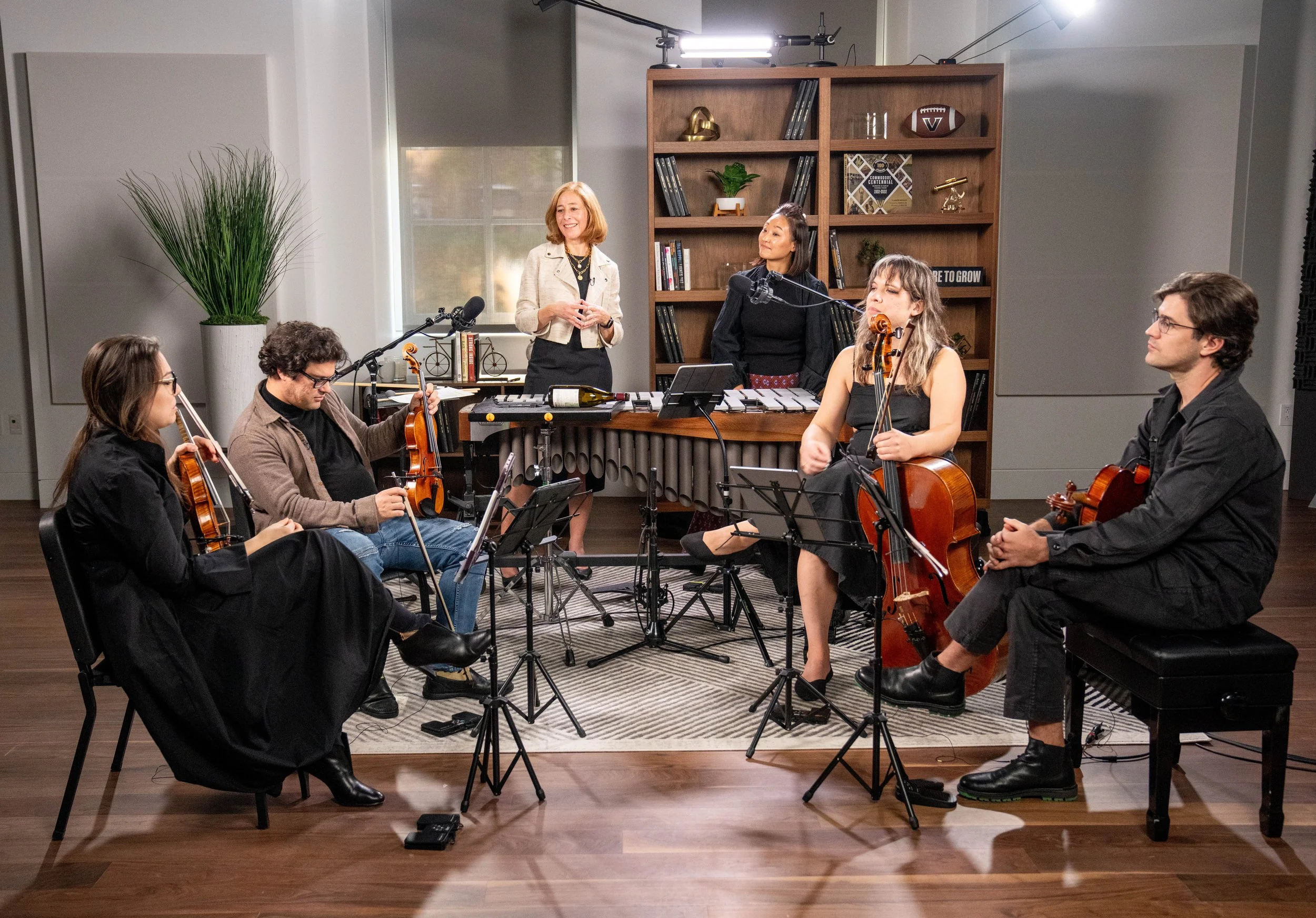
Twice a month, journey into the extraordinary with Vanderbilt University Provost C. Cybele Raver as she explores groundbreaking collaborations—proving that in the pursuit of knowledge, there are no boundaries. Listen to the podcast.
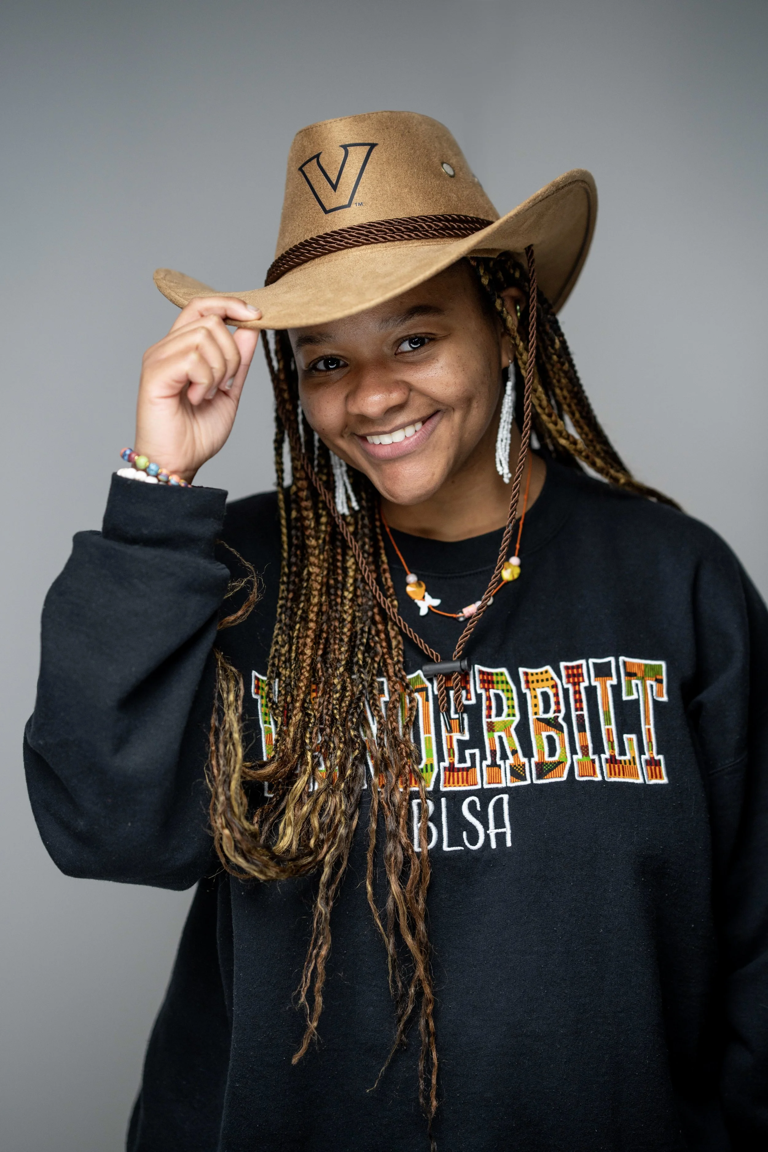
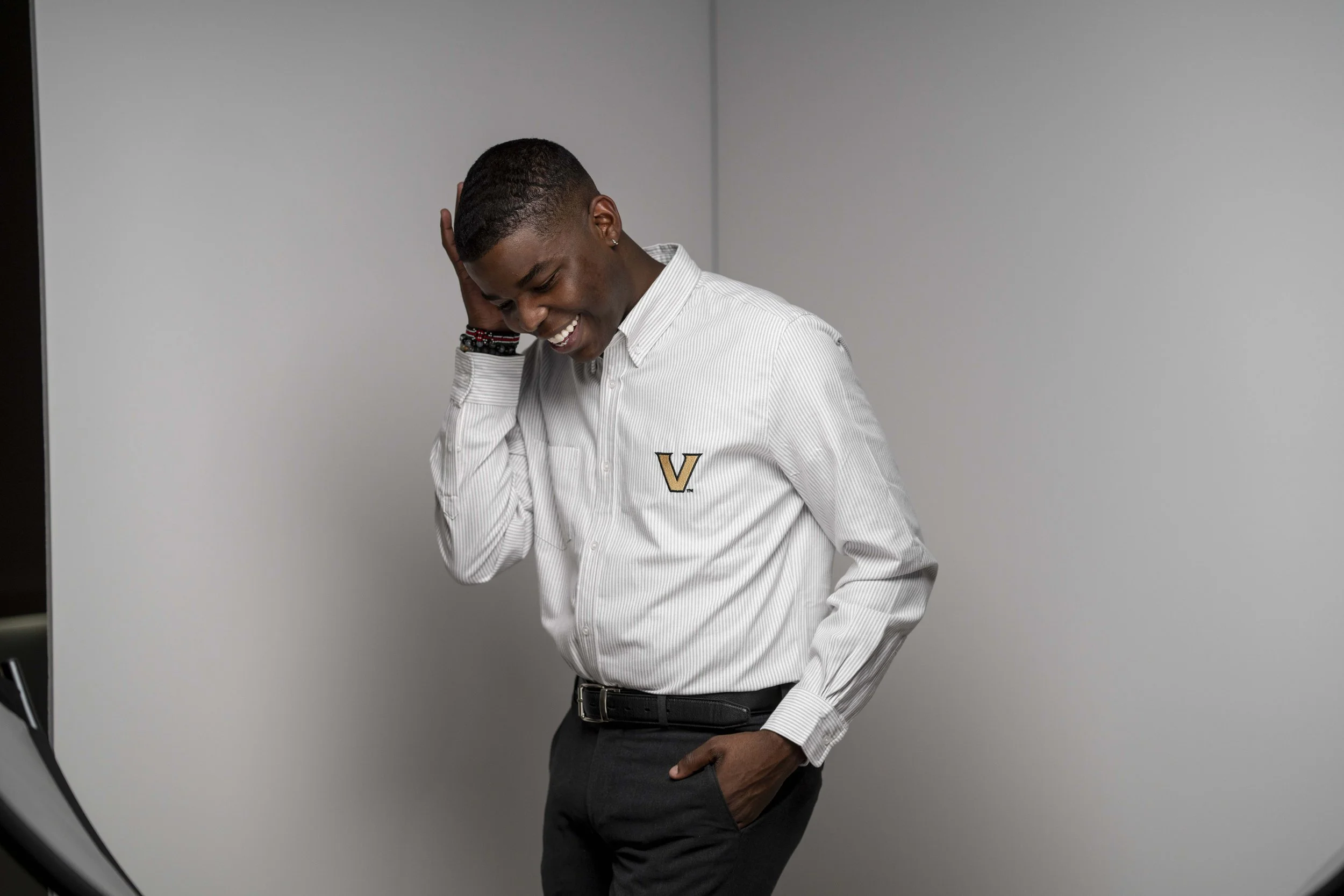
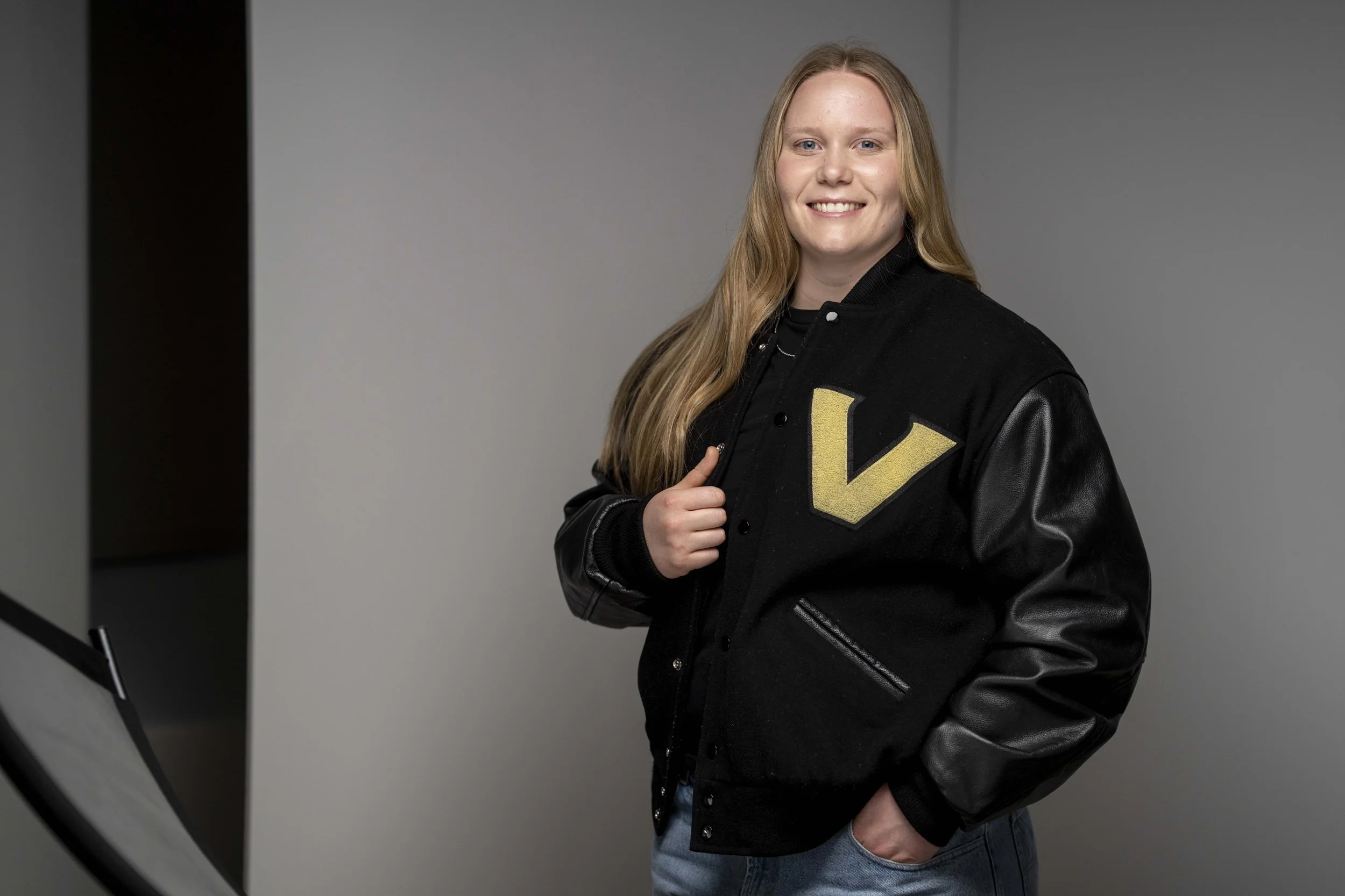
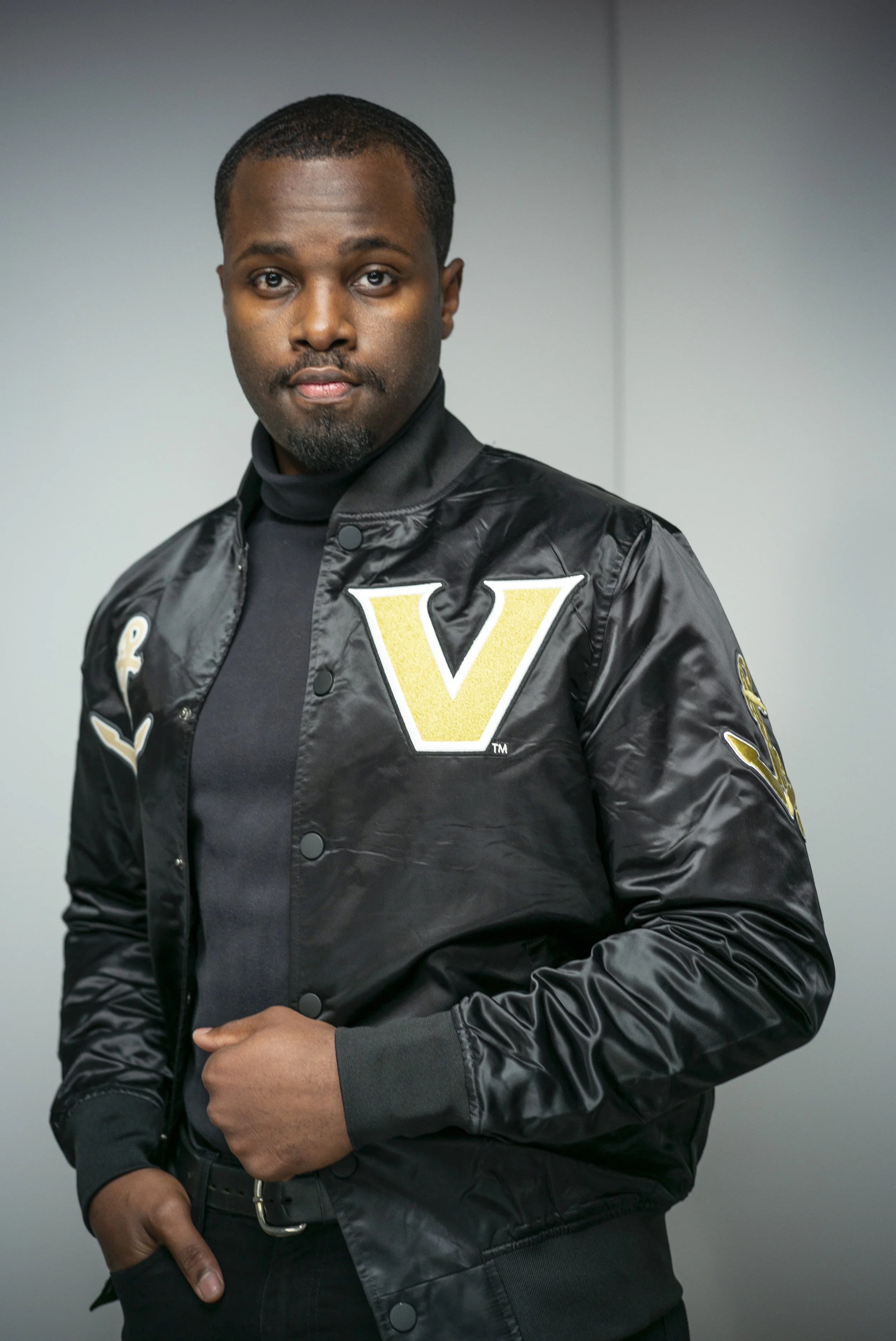
Student Stories
What’s a feature package without a Vanity Fair inspired photo shoot, scripted and BTS video content, and inspiring profiles that celebrate Vandy’s graduating class of 2025? These students were nominated by their schools for exemplifying the Vanderbilt spirit through building creative and collaborative environments, driving innovation and pursuing unique paths to make the world better.


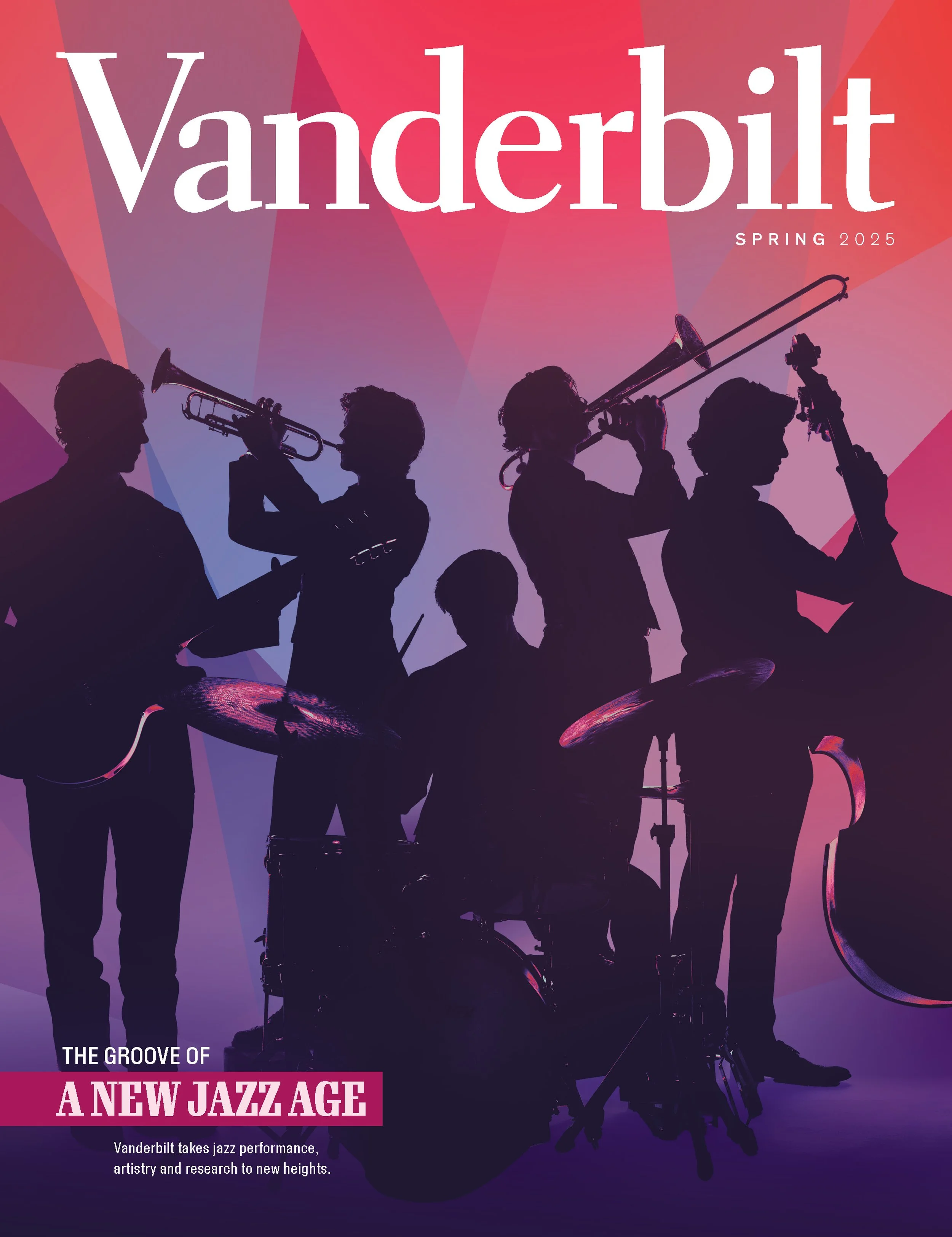
Vanderbilt Magazine
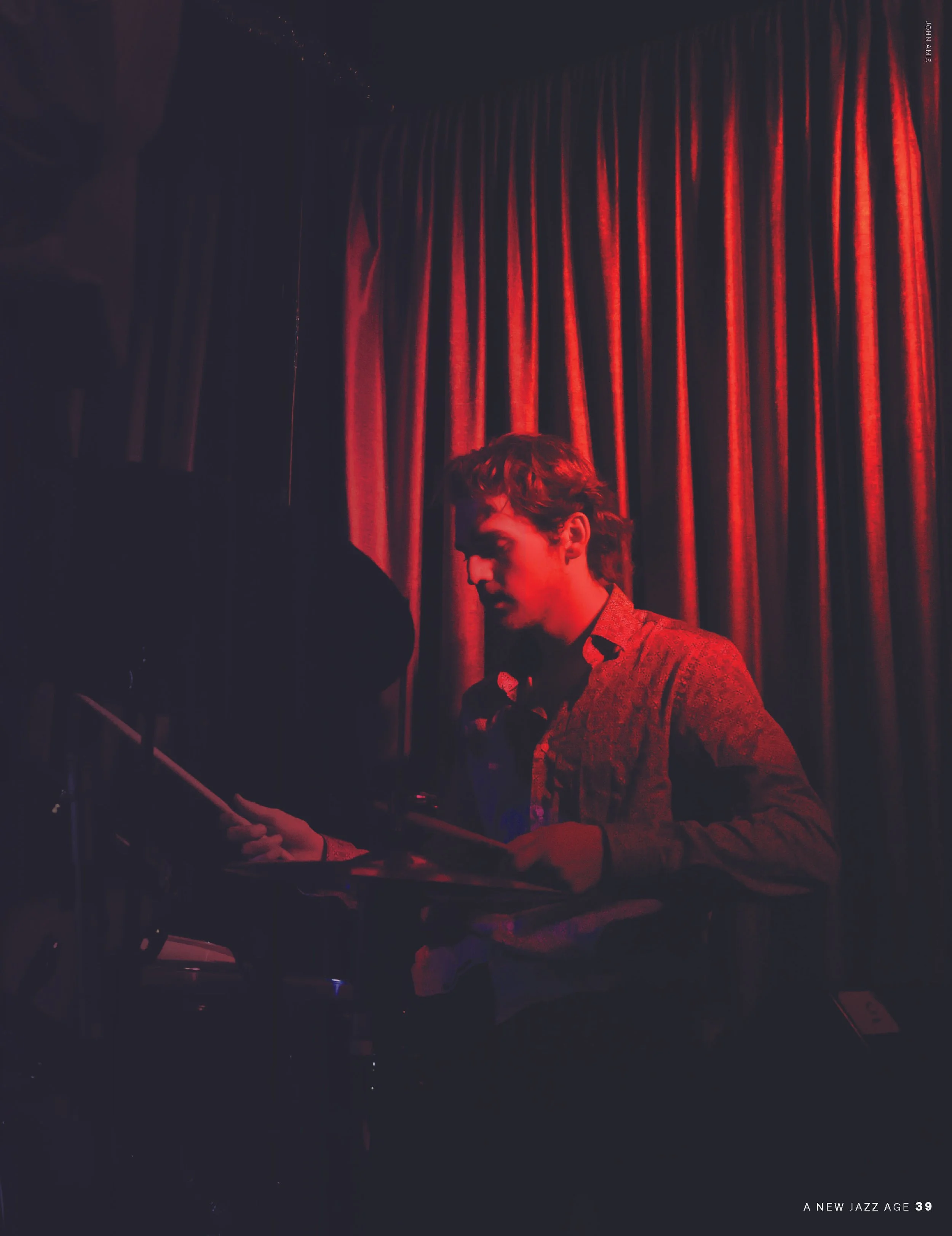
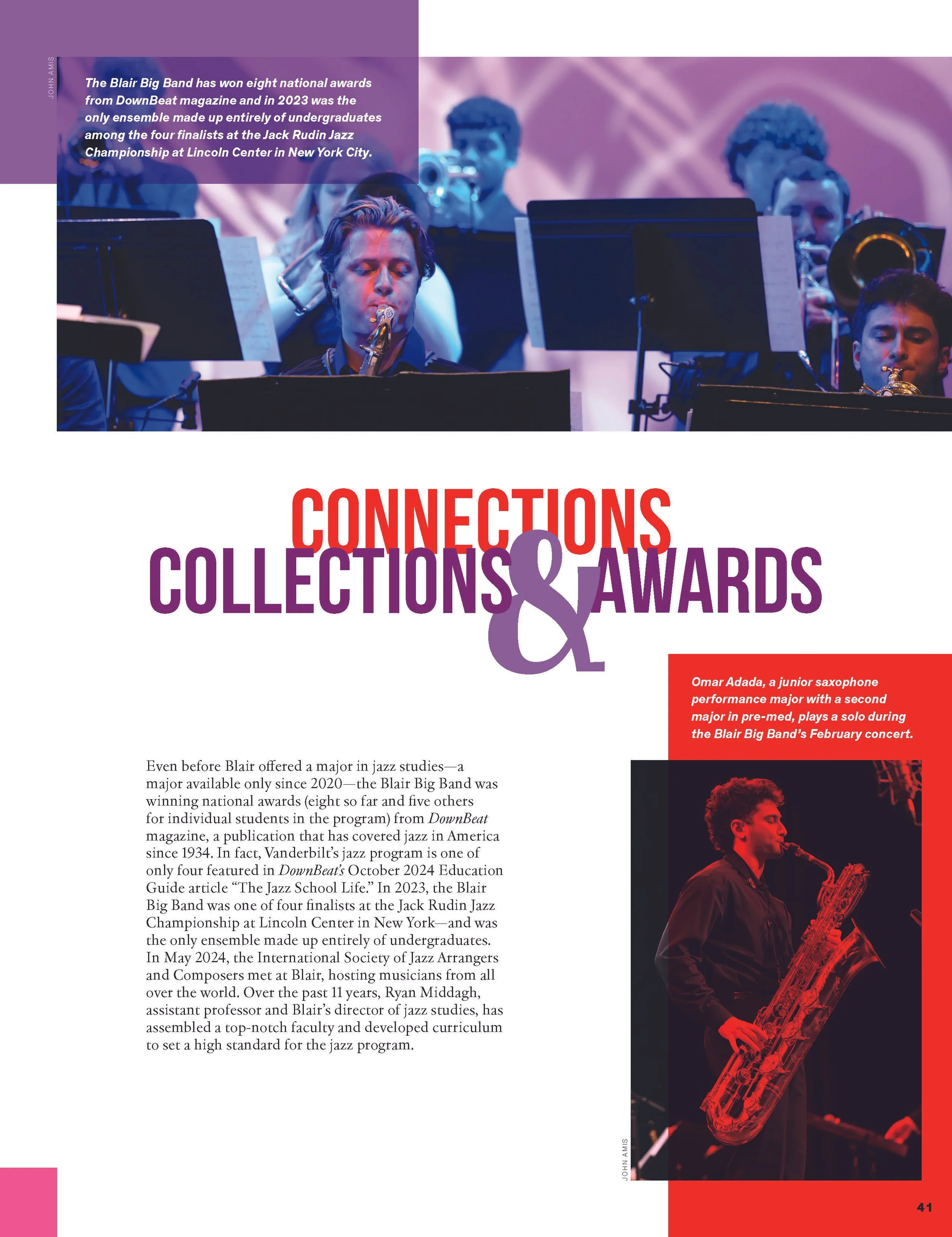
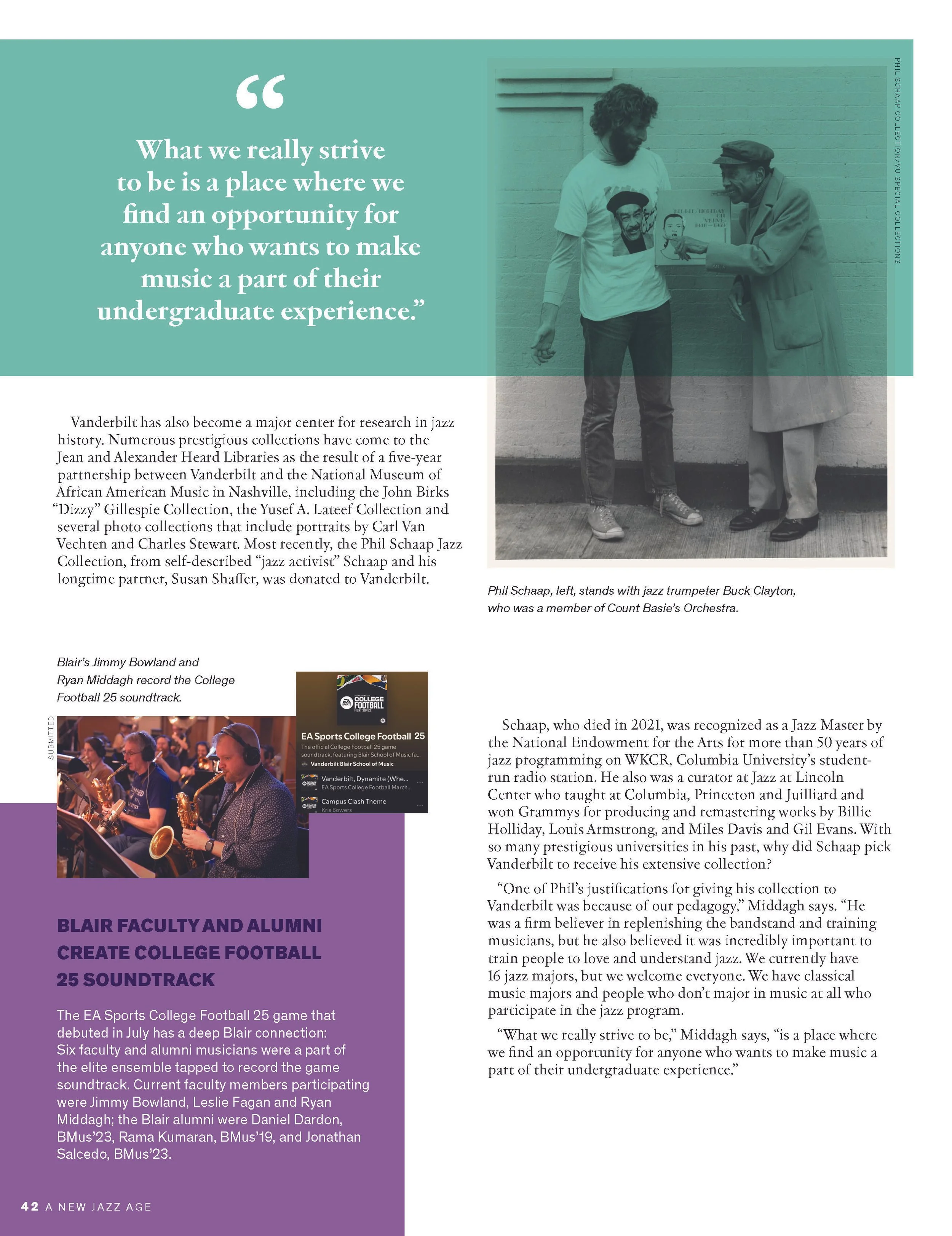
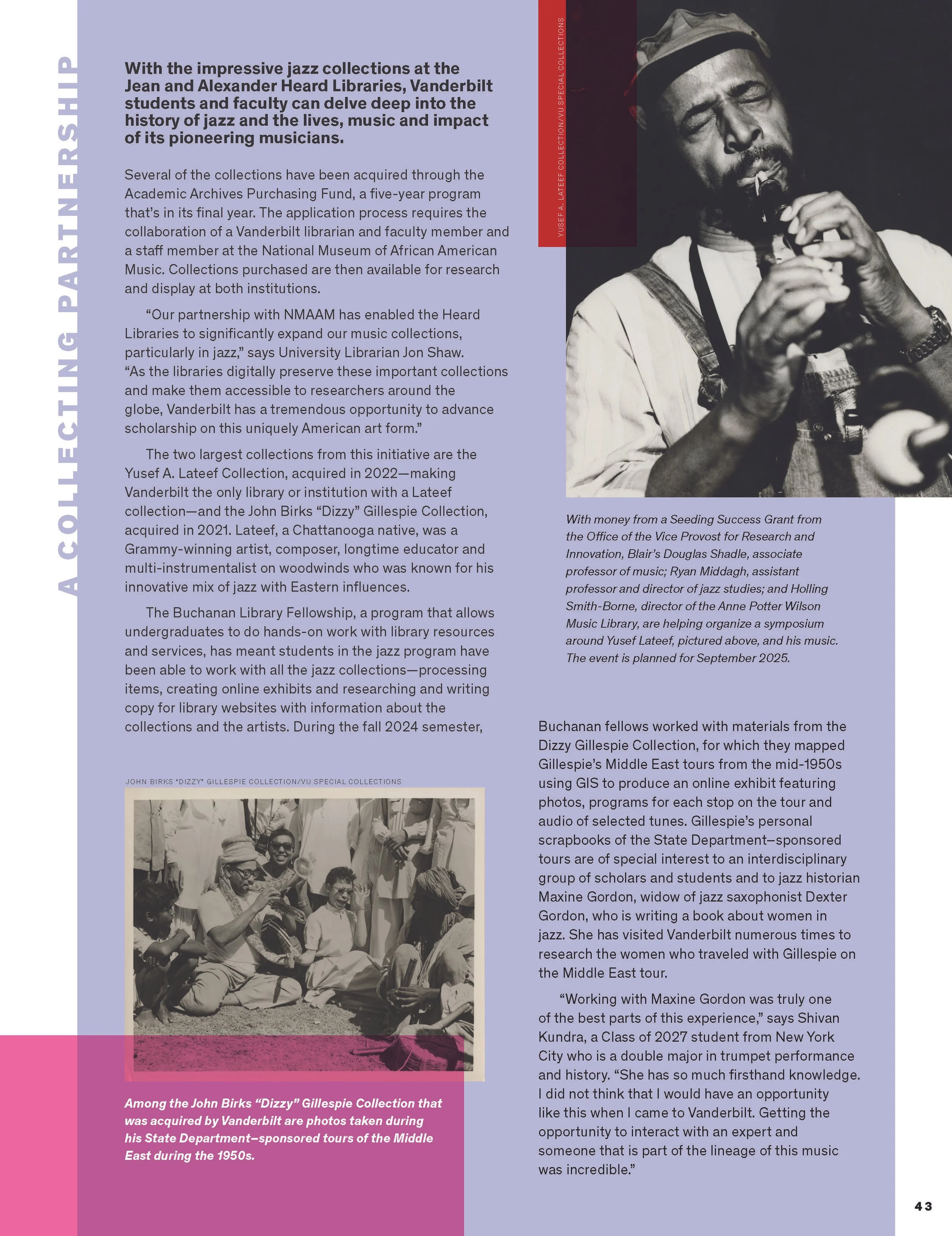
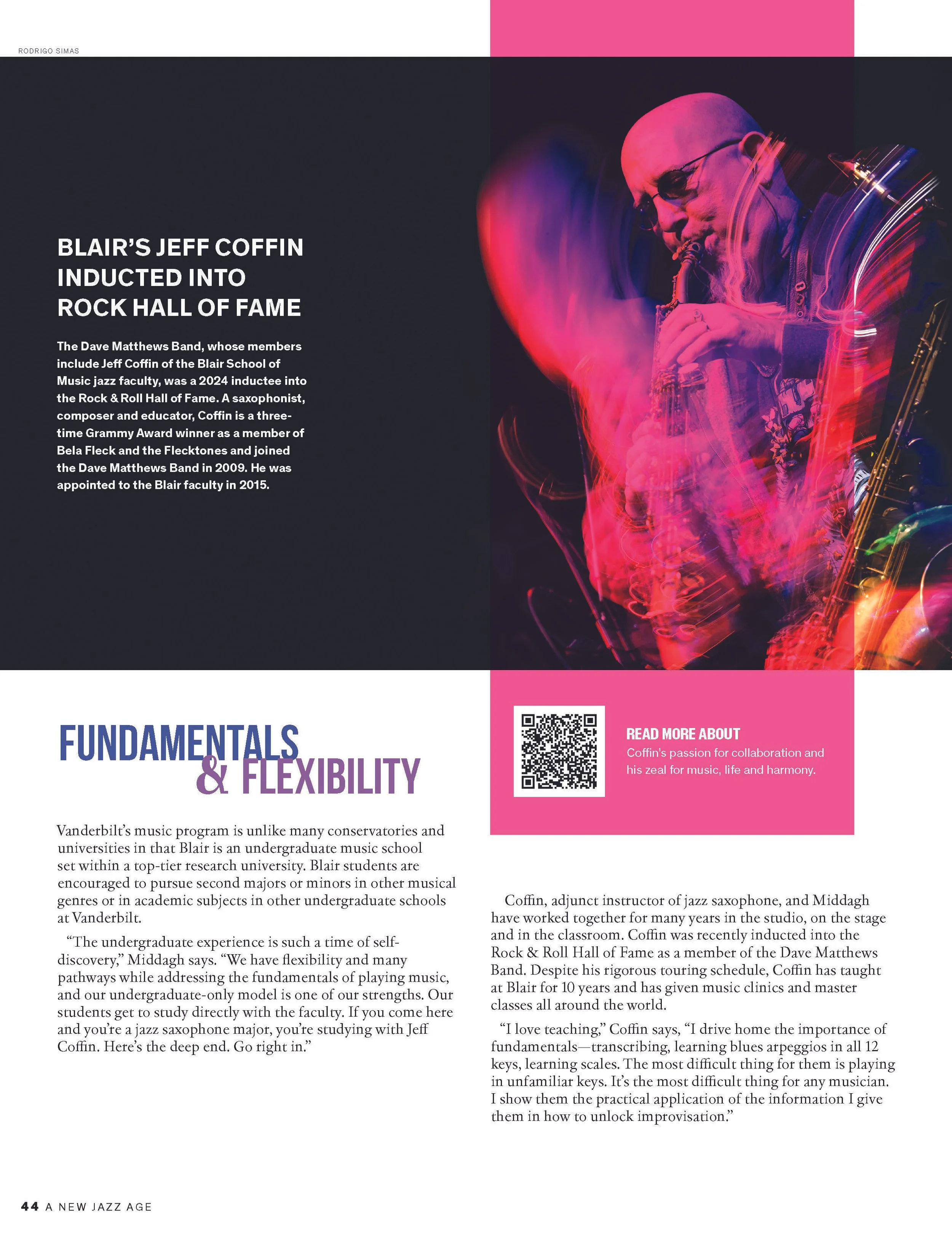
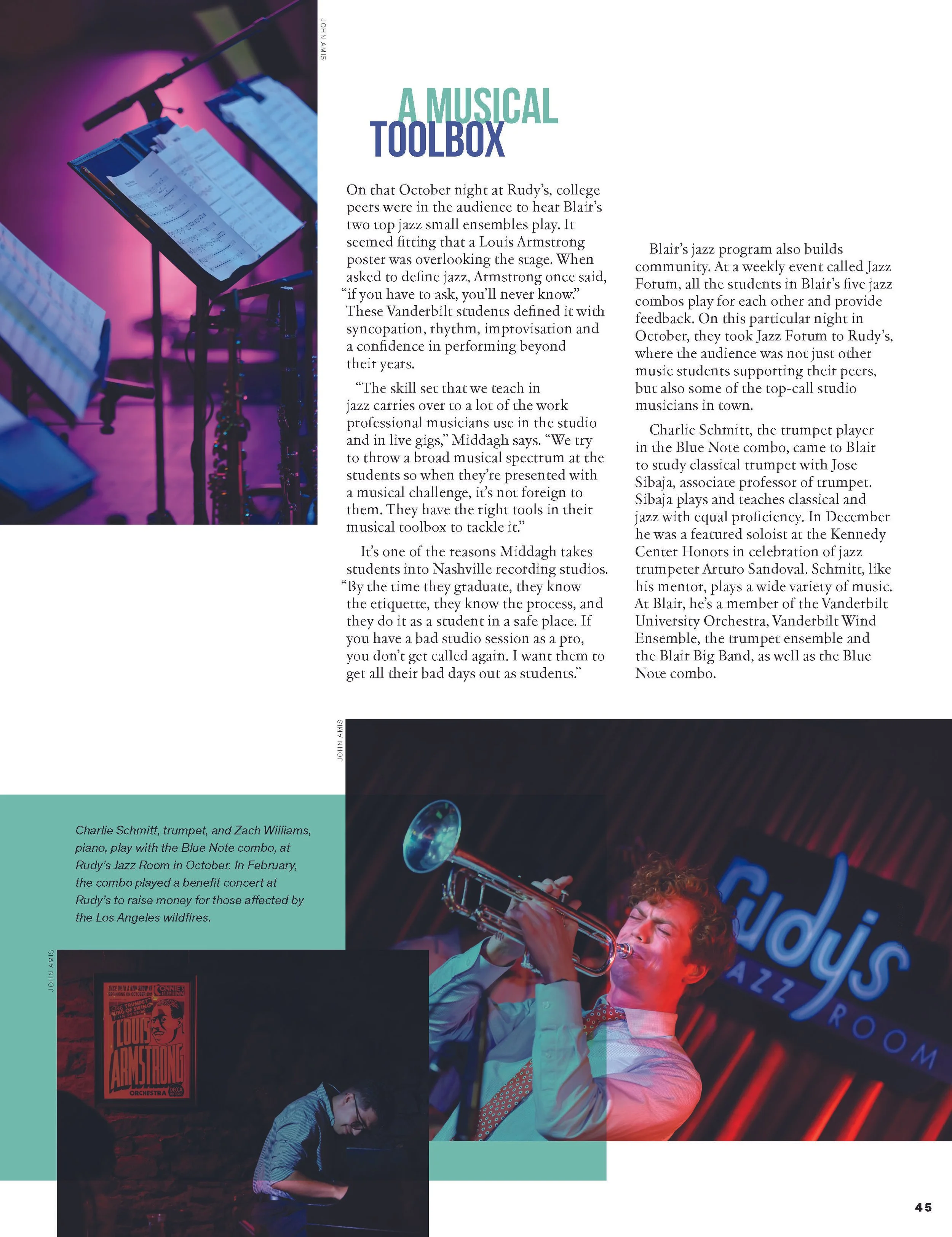
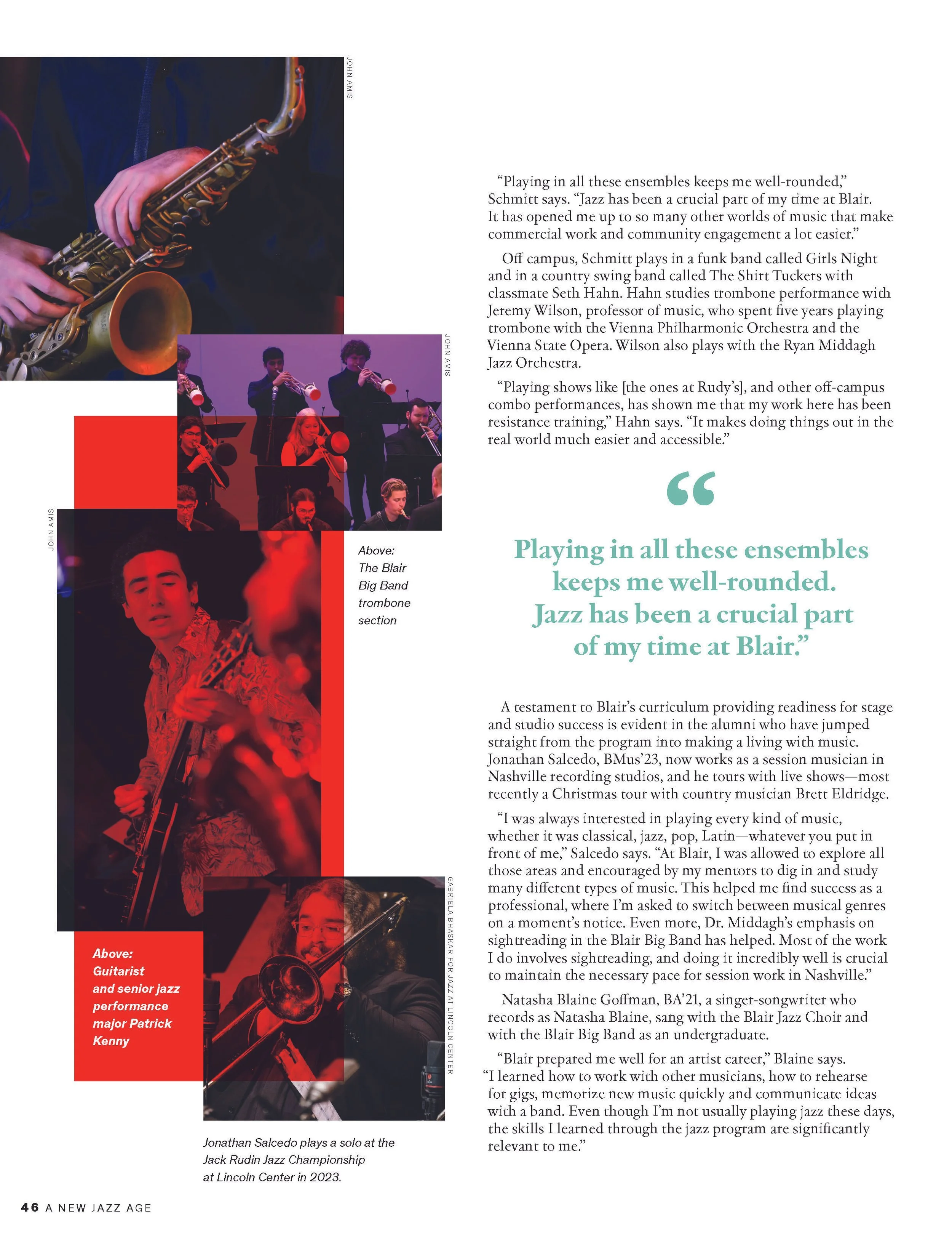
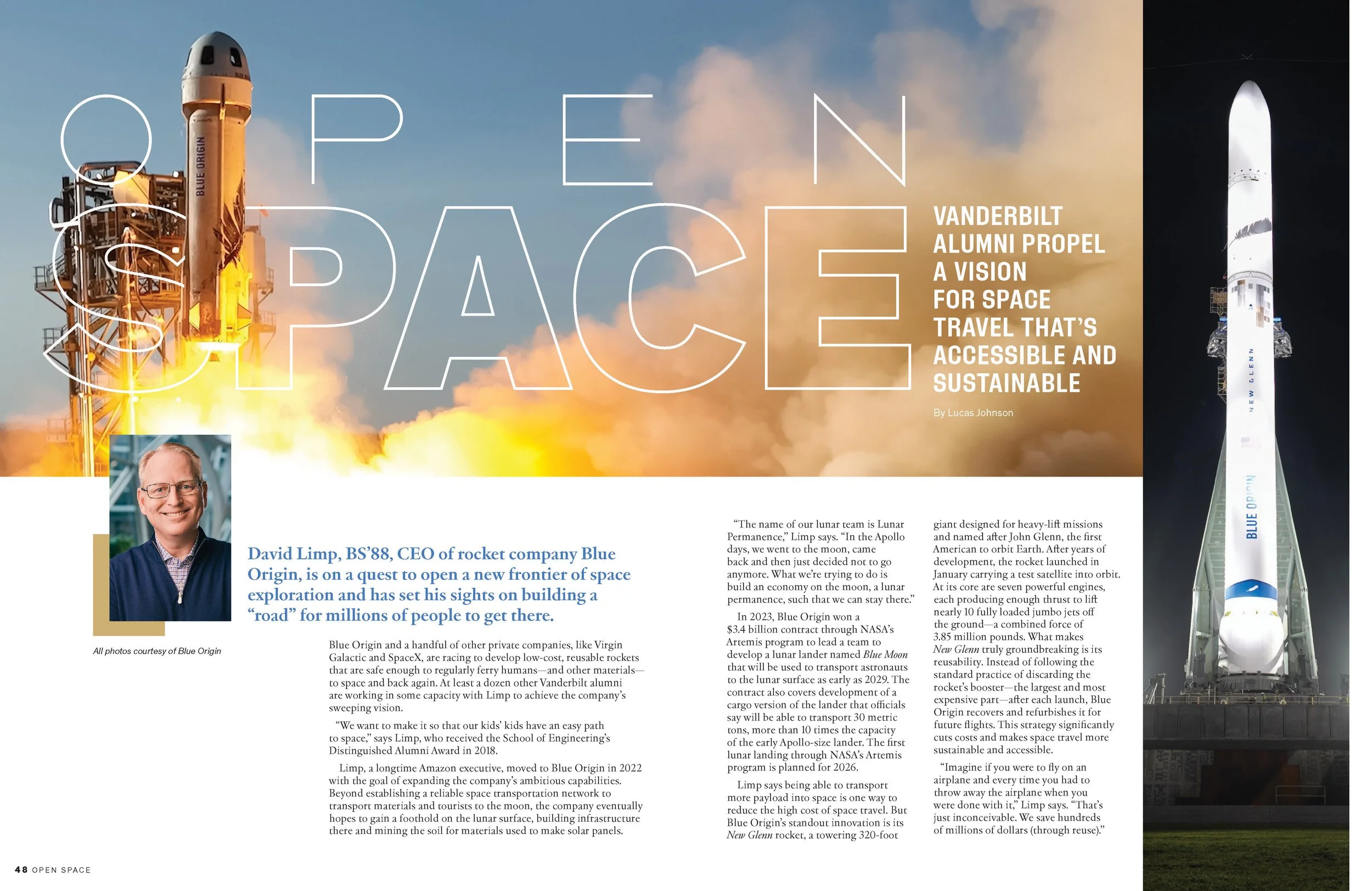
As Editor-in-Chief of Vanderbilt Magazine, I ran point in collaboration with Art Director Jason Routhier and Locomotion Creative to redesign the magazine. The goal was to increase readership engagement, content performance, brand awareness and credibility, and appeal to generationally diverse audiences with a brighter, more scannable glossy. We leaned into tighter, colloquial copy, subtle design winks and pops of color, and finally ample white space to give the pages and readers moments throughout to breathe.